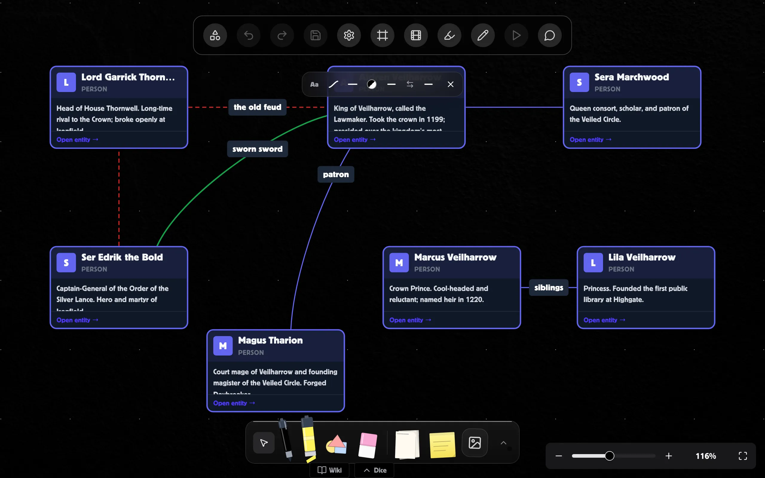
Edges are the lines you draw between nodes to show how they relate. Every
edge can have its own type, color, thickness, arrows on either end, and a
styled text label — all configurable from a glassmorphic toolbar that
appears next to the selected edge or from the right-rail inspector.
- Click a node to select it. Its connection anchors fade in around
the edges of the node.
- Click and drag from any anchor outwards. A live preview line
follows your cursor.
- Drop on another node:
- On one of that node’s anchors → the edge pins to that anchor.
The endpoint stays in that exact spot as nodes move.
- Anywhere else on the node’s body → the edge floats on that
node. The endpoint dynamically picks the closest side as either
node moves around — you get the smartest line every time.
Click any edge to select it. A compact glassmorphic toolbar appears at
the top of the viewport with a popover-backed control for each
property:
| Trigger |
What it controls |
| Aa / type icon |
Label — text input + label styling |
| Edge-type icon |
Bezier, smooth-step, step, or straight |
| Line-style icon |
Solid / dashed / dotted + line width |
| Color swatch |
Edge stroke color (or “reset to theme”) |
| Start arrow icon |
None / open arrow / filled arrow on the start |
| ⇄ |
Swap the start and end arrows |
| End arrow icon |
None / open arrow / filled arrow on the end |
| ✕ |
Close the toolbar |
Each trigger reflects the current value — without opening the
submenu you can read the edge type, line style, color, and which arrow
is on each end at a glance. The trigger gets an indigo highlight while
its popover is open.
Hover any button for a tooltip describing what it does.
When an edge is selected, the right-rail inspector body shows the same
controls but expanded inline — no popovers, with section headers,
so you can see every setting at once. Use the toolbar for quick changes
on the canvas; use the inspector when you want a deeper look or are
fine-tuning multiple settings at once.
The two surfaces are perfectly in sync — every change goes through the
same store, so the toolbar updates as you edit in the inspector and
vice versa.
Pick the geometry of the line:
- Bezier (default) — smooth curve. Best for organic, free-form
diagrams.
- Smooth step — rounded right-angle path. Good for technical
diagrams.
- Step — sharp right-angle path. Same shape as smooth step but
unrounded corners.
- Straight — a single straight line.
The label flow (“follow curve”, below) only really makes sense with
bezier or smooth-step edges; on a straight edge the curve and
horizontal modes look identical.
Two settings, both inside the Stroke submenu:
- Line style — solid / dashed / dotted.
- Width — slider from 1px to 8px in half-pixel steps. The current
value is shown to the right of the slider.
Default width is 2.5px so the line is readable on either theme. You
can always override it per edge.
Open the Color submenu for a full color picker (hex input + hue
slider + common colors).
By default, edges use a theme-aware color: black on light theme,
white on dark theme. Click Reset to theme in the color submenu
to clear a custom color and fall back to that default.
Each end of the edge can have:
- None — no arrow head.
- Open arrow — an outlined arrow head.
- Filled arrow — a solid arrow head.
The swap button (⇄) between the two arrow triggers exchanges the
start and end arrows in a single click — useful when you’ve drawn an
edge in the wrong direction and just want to flip the arrowhead.
Open the Label submenu (the Aa trigger) to add a text label.
The submenu has three rows:
A simple input. Type the label text and press Enter to commit (or
Escape to cancel). Empty input clears the label.
- Flow — Horizontal keeps the label as a chip at the midpoint of
the edge. Follow edge curve renders the text along the path itself.
- Color — color picker for the label text.
- Pill / no background — toggle the rounded background chip on or
off. Hidden in curve mode (curved labels are always plain text on
the path).
- Bold / Italic / Underline — toggle each on or off.
- Font size — slider from 8px to 28px with the current value
displayed.
The label is rendered as a chip at the edge midpoint. Two background
options:
- Pill — a rounded gray chip. The chip covers the line behind the
text so the label is always readable.
- No background — plain text. The edge line is masked with a
transparent cutout behind the label, so the line doesn’t show through
the text — even on a transparent canvas. The label looks like it’s
sitting in a “gap” in the line.
The label text follows the path itself, character by character, like
text on a road sign. Bold/italic/underline/size/color all still apply.
The label automatically flips to stay readable: if the edge runs
right-to-left and the text would otherwise read upside down, it
re-renders along a reversed path so it’s always upright. Drag the
source node past the target and watch the label flip live.
- Click the line of an edge to select it. The toolbar appears, the
edge gets a subtle indigo highlight, and the right-rail inspector
switches to the edge view.
- Click the label text of a selected edge to edit it inline (works
for both horizontal and curve labels — the input pops up
horizontally during edit either way).
- Click empty canvas to deselect. The toolbar closes.
On a busy board, connections start crossing nodes and each other. You can pin
an edge so it goes exactly where you want it.
-
Double-click the line at the point you want it to bend. A small dot
appears there and the edge routes through it.
-
Drag the dot to move the bend. It snaps flush when it lines up with the
points either side of it, so runs come out square rather than nearly square.
-
Add more bends by double-clicking the line again. A new bend inserts
itself in the right place along the route, not on the end.
-
Remove a bend by double-clicking the dot, or by clicking it once and
pressing Delete.
Right-clicking a connection offers the same things — Add a bend here,
Tidy this connection, and Remove bends — which is how you reach them
on a touchscreen, where there is no double-click.
Tidy this connection (right-click an edge) works out a route around
whatever the line currently crosses and places the bends for you. If it can’t
find a clean route it leaves the edge alone rather than making it worse.
To do the whole board at once, open Tidy in the toolbar and choose Tidy
connections. It routes every connection that needs it, as a single undo step
— and it leaves any bend you placed by hand exactly where you put it, telling
you how many it kept.
Floating endpoints follow the smartest path
Drop your edge on a node’s body (not on a specific anchor) and the
endpoint will recompute the closest side every time either node
moves. Great for free-form diagrams where you don’t care which
side the connection ties to.
Mix and match
Source can be pinned to a specific anchor and target can float, or
vice versa. Just drop the source on an anchor and the target on a
body.
Theme-aware defaults
Don’t bother setting a color unless you need a specific one — the
default already flips between black and white per theme.
Horizontal labels read in any orientation
Horizontal flow keeps the label upright no matter how the edge
runs. If you don’t need the text to follow the path, leave it on
horizontal — it’s almost always more readable.
Every edge change is undoable. Add an arrow, switch the type, drag the
width slider, recolor the label — Cmd/Ctrl + Z reverses each step
and Cmd/Ctrl + Shift + Z redoes them. See
Undo and redo for the full picture.